
Embracing dark interiors.
Dark colours are enjoying a well-deserved renaissance. While light and muted shades have been the staple of Scandi-influenced contemporary designs for decades, a darker, richer palette of saturated tones is becoming more sought after in homes where owners are wanting to create calm, characterful and intimate spaces or are looking to tap into the impact of timeless historical trends.
Although dark colours are often synonymous with period properties, you don’t have to live in a multi-storey Georgian townhouse in Spitalfields to pull off a darker design scheme. Often, simplicity is the key – sticking to classic colour combinations like ink and mustard or layering darker shades of grey – while saving bold or contrasting patterns for furnishings, lighting and accessories.
If you’re considering turning to the dark side and don’t know where to start, follow our style guide for inspiration!
Dark colours don’t always make a room feel smaller
It’s a common misconception that dark colours automatically make the walls close in on a room. In fact, the use of a single, darker colour on all the elements of an elevation – walls, door, frame and skirting – can help create depth. It’s important to consider the context and to use other techniques to draw the eye – see the way the geometric floor tiles in the scheme below create an optical illusion that opens this dark space out.

Match the ceiling to the walls
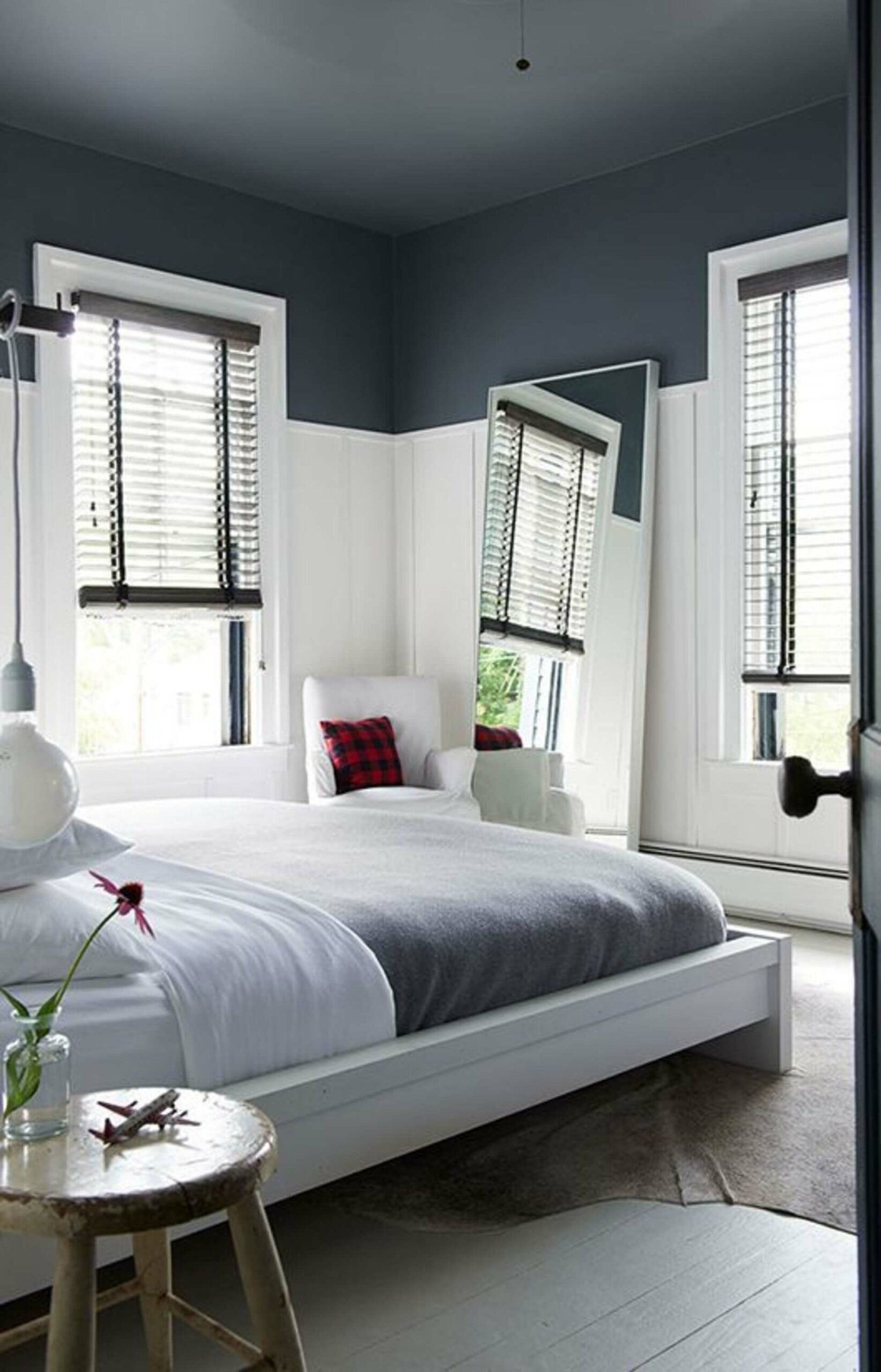
Again, most people think that a light-coloured ceiling is the best way to add the illusion of height to a room – or to further emphasise the height that already exists. In fact, the opposite is often true – continuing your dark wall colour on to the ceiling has the effect of blending the visual border between vertical and horizontal surfaces, making the room feel taller. In the example below, the dark grey bleeds from the ceiling into the top third of the walls, creating a greater sense of space.
Take the monotone approach
You can create a more harmonious look and make any room feel more spacious by matching large pieces of furniture – such as wardrobes, closets and chests of drawers – to your wall colour. With these furnishings painted in the same shade, you’ll find they blend naturally into the background and make the space feel bigger. It’s a great trick for rooms where you’re looking to build a sense of calm as there’s little to distract the eye – perfect for bedrooms.
Get creative
Using darker colours doesn’t have to mean you inevitably get a sombre effect. If you want to inject a bit more personality into your scheme, you can experiment with colour blocking – assigning different hues to different surfaces – and accentuating with richly coloured furnishings (velvet is always a good choice for darker shades) and quirky, modernist or kitsch accessories. The picture below shows how combining blocked shades of brown and magenta with a leaf-green chair works to perfection.


Experiment with patterns
You can stray from the path of plain dark colours by playing with illustration and texture. For example, this exquisite dark floral wallpaper – reminiscent of works by the Old Masters – lends an air of faded elegance to the room and helps to create a theatrical setting where you become part of your own work of art.
Combining materials such as marble, granite and dark timber can also create a naturally dark – but texturally interesting – interior scheme which can be further accentuated with mood lighting: ideal for kitchens and bathrooms.
Make the details pop
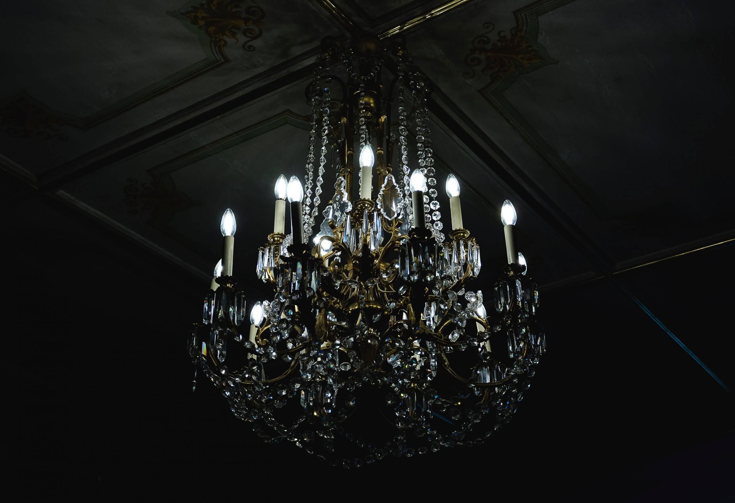
Dark colour schemes create a backdrop that’s ready to be energised with decorative items. Against a subdued palette, mirrored surfaces, as well as white and metallic elements like gold, copper and bronze really stand out!


Are you looking to join the dark side? Get in touch and we’ll talk about how we can help you successfully incorporate a little bit of darkness into your home. Submit our get in touch form or give us a call.